By combining the distribution of temperature and humidity with the area of the graph occupied by each biome, it can provide the percentage of the world your biomes will cover:
The different coloured rings in the distribution diagram show the following:
- Square grey outline — the technical limit of temperature and humidity. The world does not contain temperature or humidity values in this range.
- Red dotted ring — the practical limit of temperature and humidity. The temperature and humidity in the world falls within this ring 99.99% of the time.
- Red solid rings — these indicate the four quartiles. 25% of the world has a temperature and humidity falling outside the outermost quartile ring. The next ring has 50% of the world inside it, and 50% outside. The innermost red ring contains 25% of the world inside it, with 25% between it and the middle ring, etc.
- Blue solid rings — these are spaced at 10 percentile intervals. Note that the 50th percentile ring is drawn red, but can also be considered one of the blue rings.
- Red dot — the center of the distribution. This is the most common temperature and humidity value.
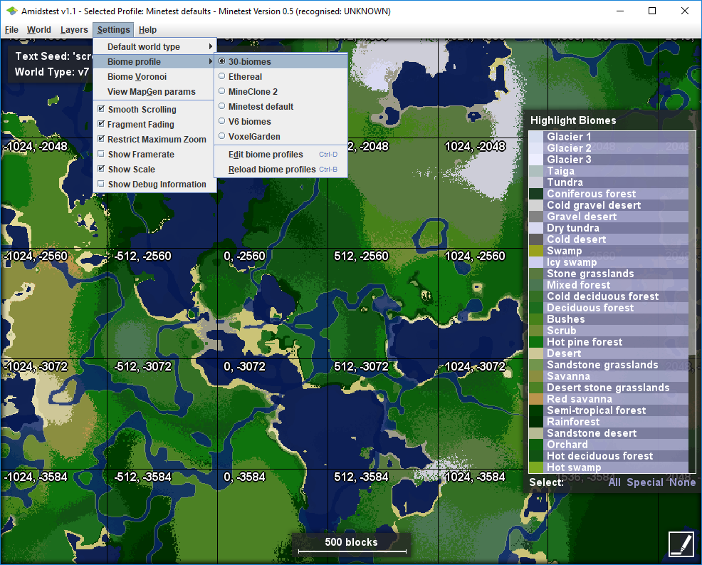
Downloads, forum thread. The Voronoi diagram is access via the Settings→Biome Voronoi menu
For anyone not familiar, Amidst will already let you scroll around worlds to see how your biomes behave: